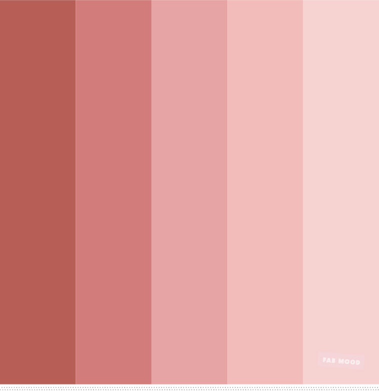
Neutrals and monochromes in West aesthetics are closely related to wider changes in culture and artistic development that occurred in the first half of the 20th century. This followed partly because of the principle of modernism, which pushed for simplicity, functionality, and a rejection of overbearing ornamentation. Pioneers such as Le Corbusier and Bauhaus all help set the precedent in terms of where cleanliness, minimal forms, and neutral colours become the rule in a designing sense. This view aimed to appeal to functionality as well as emphasizing the use of less elaboration when it came to both color and ornamentation. These would be in direct contrast to the lavish, intricate styles of previous movements like Art Nouveau and Victorian design.
A style such as that, minimalist style, was further consolidated after World War II through the mid-century modern movement, which propagated to new levels of understatement, in many cases, its no-frills colors bequeathed to grays, whites, and beiges against natural materials of wood and metal. After the war, the societies in the West were looking forward to the future and wanted their houses and cities to reflect something fresh and simple with order and optimism for the future. This starkness and clarity were symphonic with the design of a world that sought new clarity in the post-chaos era.Monochromes and neutrals reached their zenith as a color scheme with the ascendance of Scandinavian design in the late 20th century. Scandinavian minimalism, with its philosophy on functional pieces of furniture, airy and light internal spaces, further pushed the neutral aesthetic into the collective design consciousness of the world. Sustainability and sensitivity have made neutral aesthetics applicable in contemporary times. Neutral tones and monochromes are clean, simple ways of achieving a clutter-free lifestyle. Neutrals and monochromes connote serenity, clarity, and an uncluttered lifestyle, in turn making them fit into today’s trends of taking care of one’s mental well-being and environmental consciousness. Neutral tones seem synonymous with nature and serenity and timelessness, appealing to a person in the process of creating soothing and harmonious spaces.Therefore, it can be considered that modernist principles, post-war design movements, and continuing simple and sustainability-linked cultural values have influenced the continued appeal of neutrals and monochromes.Scandinavian design that spread from the 1950s and 60s, while also advocating for the use of neutral colours and natural materials. The philosophy behind embracing simplicity, functionality, along with an affinity with nature characterizes Western consumers’ appeal and influences contemporary aesthetics. The particular minimalist art movement of the 1960s and 70s especially enriched monochromatic palettes and simple geometric forms. These had intense influence on visual culture. The fashion too spilled over from this aesthetic, as minimalist, neutral-colored clothing styles were popularized by designers Calvin Klein and Jil Sander. The dawn of the digital age ushered in a new visual lexicon. Simple, clean interfaces in early devices and software also tended to lean towards neutral color schemes. As they entered the world of web design and digital marketing, the aesthetic only drove minimalist, neutral palettes further into the psyche. Our increasingly visual world left people yearning for an increasingly rare haven in the renaissance of simplicity and calm within personal spaces. Neutral monochromatic interiors indicated a way out of chaos life and therefore, were gaining popularity.Shifting environmental awareness played its role too in this matter. Neutral and monochromatic designs are not seen as anything more timeless and less fashionable than any other color, fitting into the growing demand for longer-lasting products that do not have an end date. Social media, especially Instagram, has been one of the major factors influencing color trends. Filters on Instagram that came out at the beginning displayed saturated tones, which brought back desaturated tones into photography, and consequently, in fashion and design.Neutral color schemes come with tremendous practical advantages in interior design and fashion. They facilitate mix and match and provide a versatile background for changing trends, as well as making spaces appear larger and more cohesive. Mindfulness and minimalism promoted in the Western world have lately made them appreciate neutral aesthetics. Neutral color schemes are often calming and clear and convey a clutter-free lifestyle.This general triumph of neutrals and monochromes in Western aesthetics is symptomatic of a multiple complex interplay of historical, cultural, and technological influences. All these reflect more profound currents of change within Western values and lifestyles, from the impact of modernist design principles to practical benefits realized through neutral palettes in the digital era. Therefore, even as and even when the beautiful appearance of neutral and monochromatic features in the modern world remains unfun and serves only to produce an experience of faded beauty, they are likely to be attractive as a way of creating composure and eternal elegance in everyday life.


Comments are closed.